Painting your ceiling the same color as your walls creates cohesive visual flow and can dramatically alter spatial perception—light uniform colors eliminate boundary contrast to make rooms feel larger and taller, while dark monochromatic schemes compress space for intimacy. We’ve found this approach works brilliantly in rooms with minimal trim, though it may flatten spaces rich with architectural details that benefit from contrasting definition. Your decision ultimately hinges on whether you’re prioritizing spatial expansion, architectural emphasis, or design simplicity, factors we’ll explore through practical application strategies below.
Key Takeaways
- Painting walls and ceilings the same color creates visual cohesion, eliminates boundaries, and simplifies the painting process while reducing costs.
- Light uniform colors make rooms feel larger and ceilings appear higher by reflecting light and removing contrast that defines spatial limits.
- Dark monochromatic schemes compress space and create intimacy, making tall rooms feel cozier but potentially reducing perceived width.
- Matching paint can flatten visual interest and obscure architectural details, eliminating natural focal points and reducing dimensional depth.
- Rooms with minimal trim benefit from uniform color, while spaces with decorative molding look better with contrasting ceiling and wall tones.
Benefits of Painting Walls and Ceilings the Same Color
When walls and ceilings share the same hue, the visual boundaries between surfaces dissolve, creating a cohesive envelope of color that fundamentally transforms how we perceive interior space.
This unified approach delivers practical advantages we can’t overlook. We’ll streamline our painting process by eliminating tedious taping around moldings, reducing both labor and drying times considerably. The technique proves cost-effective, requiring just one paint purchase while simplifying future touch-ups and patch work.
Balanced color palettes emerge naturally when we’re working with a single shade, allowing architectural details to either blend seamlessly or stand out through strategic contrast. We’ll find that intentional visual shifts occur through deliberate accent choices rather than default color breaks, giving us greater control over spatial hierarchy and design emphasis.
How Uniform Color Affects Room Size and Spatial Perception
When we apply the same color to walls and ceilings, we fundamentally alter how occupants perceive room dimensions through the manipulation of visual boundaries. Light, high-luminance colors eliminate contrast points that typically define spatial limits, causing surfaces to recede and creating the perception of expanded volume.
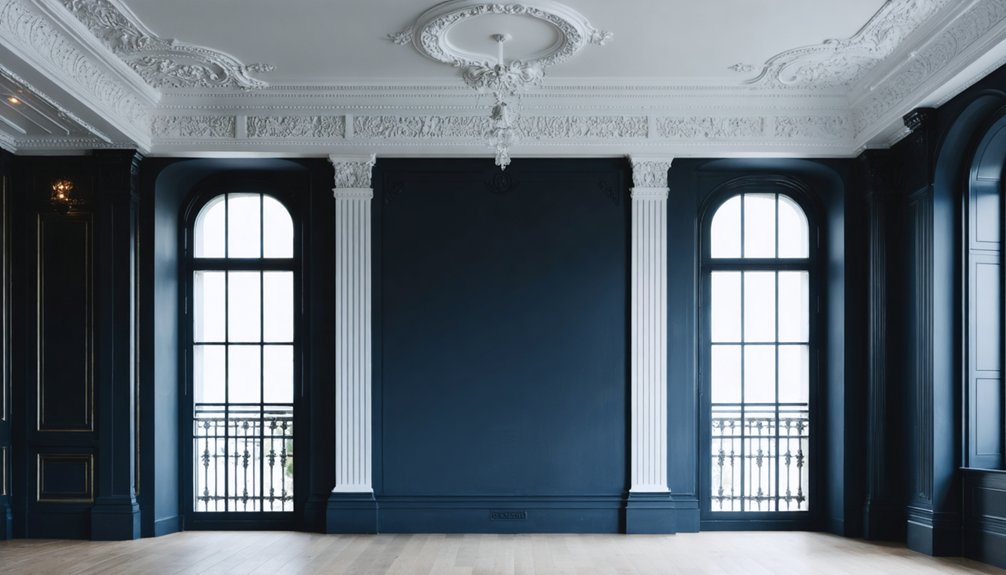
Conversely, dark uniform applications compress perceived space by absorbing light and establishing visual weight that draws boundaries inward, reducing apparent room height and overall dimensions.
Creates Visual Height Illusion
Ceiling luminance functions as the primary determinant of perceived room height, regardless of color temperature or saturation levels. When we paint ceilings and walls the same bright color, we’re leveraging luminance effects on height to create upward spatial expansion. Research confirms that brightest possible ceilings consistently register as higher in our visual perception, whether we choose chromatic hues or achromatic whites.
The uniform application eliminates visual interruptions between surfaces, removing the typical ceiling-wall boundary that anchors our depth perception. Without this contrasting marker, our eyes can’t establish fixed reference points, causing the ceiling to appear lifted. This effect remains consistent across pale and saturated colors—what matters is maintaining high luminance values. We’re not just painting surfaces; we’re manipulating spatial psychology to transform how we experience vertical dimensions.
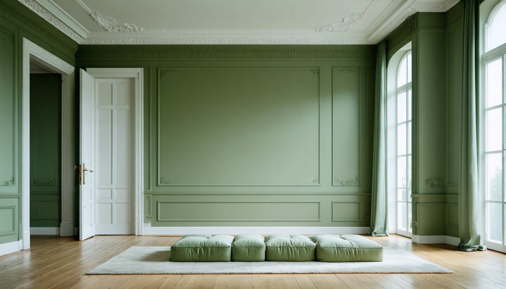
Light Colors Expand Space
Light colors fundamentally alter our spatial perception through their Light Reflectance Values (LRVs)—a measurable scale from 0 to 100 that quantifies how much illumination a surface returns to the eye. When we paint walls and ceilings in matching light tones, we’re maximizing luminance perception by bouncing natural and artificial light throughout the room.
This uniform reflectivity blurs boundaries between surfaces, signaling larger dimensions to our brains. The effect intensifies with cool light colors—blues and greens that naturally recede, pushing visual boundaries outward. Color temperature effects combine with high LRVs to create this expansion illusion.
Dark Shades Compress Rooms
Dark pigments fundamentally reverse the spatial expansion we’ve just explored by absorbing rather than reflecting light energy. When we apply uniform dark shades across walls and ceilings, we’re orchestrating enhanced spatial enclosure through reduced light reflectance values.
This compression effect intensifies in rooms with inadequate illumination—typically below 300-500 lux—where the boundaries visually contract.
How dark uniformity transforms your space:
- Ceiling darkness makes vertical planes feel lower, inducing intimacy in tall rooms
- Side wall absorption pushes lateral boundaries inward, narrowing perceived width
- Visual clutter reduction occurs as dark surfaces soften edges when trim matches walls
- Volume compression creates cocoon-like atmospheres versus the openness of lighter schemes
We’ve found this compression isn’t inherently negative—it’s strategic spatial manipulation that requires contextual awareness and deliberate lighting design.
Drawbacks of Monochromatic Wall and Ceiling Paint
When we eliminate contrast between walls and ceilings, we strip the room of its natural focal points and dimensional depth. Crown molding, coffered details, and other architectural elements that typically define a space’s character become visually absorbed into the monochromatic field.
Without these visual breaks to guide the eye, rooms can feel simultaneously flat and monotonous, lacking the layered interest that makes spaces feel thoughtfully composed.
Lack of Visual Interest
Why do so many designers hesitate to embrace fully monochromatic rooms? When we paint ceilings and walls identically, we’re confronting the challenge of uninspired aesthetic appeal that can flatten our spaces into forgettable backgrounds.
This uniform approach creates reduced visual dynamism through several key issues:
- Monotonous appearance that eliminates the natural contrast between architectural planes
- Diminished focal points where our eyes find nowhere compelling to rest
- Suppressed accent opportunities that prevent decorative elements from standing out
- Claustrophobic sensations in smaller or windowless spaces that need visual breathing room
We understand the desire for cohesive design, but this uniformity often backfires. Without varied hues creating depth and interest, our rooms risk becoming spaces we simply occupy rather than environments we truly enjoy inhabiting.
Architectural Features Get Lost
Beyond creating spaces that lack visual dynamism, monochromatic ceiling and wall treatments actively obscure the architectural elements that give rooms their character and definition. When we paint crown molding, exposed beams, and decorative trim the same color as surrounding surfaces, these features lose their ability to frame and define our spaces. The geometric patterns and perimeter banding that once provided elegant termination points around windows and doors simply disappear.
We’re also eliminating opportunities for layered lighting effects and tactile material accents that make rooms feel intentionally designed rather than merely painted. Wood paneling, acoustic tiles, and specialized ceiling materials contribute textural richness through color variation—benefits we sacrifice when applying uniform color schemes. Without this visual differentiation, even carefully planned architectural coordination becomes invisible to occupants.
Impact on Architectural Features and Design Elements
Architectural features serve as the structural vocabulary of a space, and our color choices either amplify or diminish their visual impact. When we’re deciding whether to match ceilings to walls, we must consider how this affects the elements that give our rooms character.
Crown molding and trim demand careful consideration:
- Angled ceilings: Uniform color maximizes vertical lines, emphasizing intentional architectural drama and creating cohesive flow
- Crown molding: Contrasting color preserves architectural definition, maintaining trim as a focal design element
- Built-in features: Matching paint creates immersive cohesion, amplifying standout elements through monochrome continuity
- Flat ceilings: Same-tone treatment diminishes depth unless the room lacks trim entirely
We’ll find that rooms rich with molding benefit from contrast, while minimal trim spaces embrace the unified approach beautifully.
Practical Considerations for Maintenance and Future Updates
While aesthetic decisions shape our immediate perception of a space, the practical realities of maintenance and future modifications carry equal weight in our color strategy. When we commit to matching walls and ceilings, we’re accepting stricter surface preparation requirements—every flaw becomes magnified across continuous planes. Touch-ups demand meticulous color matching, as uniform schemes reveal even slight variations in sheen or tone.
The long term aesthetic durability of this approach hinges on our willingness to perform thorough maintenance. Changing a single surface necessitates repainting the entire room to preserve visual cohesion. We’ll find ourselves constrained when incorporating accent features or updating lighting fixtures that require contrasting backgrounds. This commitment works best when we’re confident in our color choice and prepared for full-room refreshes rather than targeted updates.
Best Practices for Deciding Your Ceiling Color Strategy
Because ceiling color decisions affect every visual and spatial element within a room, we must approach this choice through systematic evaluation rather than isolated preference.
We’ve developed a framework that guarantees successful color coordination:
- Observe paint samples at multiple times throughout the day, noting how both natural and artificial light alter ceiling appearance compared to walls
- Test finish combinations using the same color—flat ceilings paired with satin walls create subtle depth while maintaining visual harmony
- Assess architectural complexity within your space; angled ceilings and intricate details benefit from unified color envelopes
- Consider adjoining rooms as connected environments where consistent color schemes establish flow
Our approach prioritizes spatial awareness alongside aesthetic goals. We recommend evaluating room dimensions, ceiling height, and light sources before committing to matching or contrasting schemes.
Frequently Asked Questions
What Paint Finish Works Best for Matching Walls and Ceilings?
Like layers in a well-composed painting, we recommend flat or eggshell paint finish for ceilings and walls, reserving satin or semi-gloss paint finish for trim. This hierarchy creates spatial depth while maintaining cohesive color flow throughout your room.
How Does Lighting Type Affect Same-Color Walls and Ceilings?
We’ll find that recessed lighting impacts how your ceiling reads lighter than walls, while ambient light effects create uniform illumination by bouncing across surfaces. Together, they’ll determine whether your same-color scheme feels cohesive or unbalanced throughout your space.
Should Bathroom Ceilings Be Painted the Same Color as Walls?
There’s no one-size-fits-all answer—we’d consider natural lighting impact and your bathroom’s proportions first. We recommend utilizing semi-gloss paint finish for moisture resistance. Together, let’s evaluate your space’s architectural features and ambient conditions before deciding.
Can You Use Same-Color Technique With Wallpaper on Walls?
We’ll achieve cohesive flow by matching ceiling paint to your wallpaper’s dominant color. This technique works beautifully with various wallpaper placement options while coordinating wallpaper patterns with ceiling tones creates seamless shifts that unify your design vision.
Does Matching Ceiling and Wall Color Work in Open-Concept Spaces?
Like a river flowing seamlessly through connected rooms, we’ve found matching ceiling and wall colors enhances spatial continuity in open concepts. It influences perception of ceiling height while unifying sight lines, creating the cohesive sanctuary we all desire.