We recommend starting your color selection with an inspiration piece that provides 3-5 harmonious hues as your palette foundation. Apply the 60-30-10 rule to distribute colors effectively: 60% dominant wall color, 30% secondary surfaces, and 10% accent details. Consider how natural and artificial lighting affect color perception, matching warm or cool tones to each room’s function. Balance timeless neutrals with strategic bold accents to create cohesion while maintaining design flexibility. Our thorough approach below reveals the specific techniques that’ll transform your color selection process.
Key Takeaways
- Select an inspiration piece first to establish a cohesive palette of 3-5 harmonious colors for your entire space.
- Apply the 60-30-10 rule: 60% dominant wall color, 30% secondary surfaces, 10% accent details for balanced distribution.
- Evaluate natural light direction and artificial lighting types, as they significantly alter how paint colors appear on walls.
- Match paint colors to room function: warm tones for social spaces, cool blues for bedrooms, energizing hues for workspaces.
- Balance timeless neutral foundations with strategic bold accents to maintain flexibility and create visual interest without overwhelming.
Start With an Inspiration Piece to Guide Your Color Selection
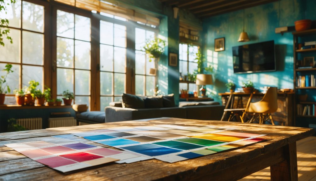
When selecting interior paint colors, designers rely on a foundational principle: guarantee an anchor piece before making any color commitments. We recommend choosing artwork or a textile that resonates with your aesthetic vision first.
This color inspiration serves as your palette foundation, containing 3-5 harmonious hues that eliminate guesswork from the selection process.
Your anchor piece naturally provides both feature colors—those rich, deep tones that create visual impact—and your neutral foundation for walls and larger surfaces. This approach prevents the common pitfall of random color selection that lacks cohesion.
Apply the 60-30-10 Design Rule for Balanced Color Distribution
The 60-30-10 rule provides a proven framework for distributing paint colors throughout your interior space, where 60% represents your dominant wall color, 30% encompasses secondary surfaces like trim or accent walls, and 10% appears in smaller painted details.
We’ll examine how these proportions create visual hierarchy and prevent color imbalance that can make rooms feel chaotic or monotonous. By understanding these ratios and their application to architectural elements, you’ll achieve professional-level color harmony that guides the eye naturally through your space.
Understanding the Color Proportions
Mastering color distribution transforms a room from chaotic to cohesive, and that’s where the 60-30-10 rule becomes indispensable. We’re applying fundamental color theory application that guarantees our spaces feel intentionally designed rather than randomly assembled.
The dominant 60% establishes our visual foundation—typically walls in neutrals like white, gray, or beige that create tranquility. Our secondary 30% introduces complementary hues through furniture and larger decor, adding depth without competing for attention. The accent 10% delivers strategic pops of energy via pillows, artwork, and accessories.
These proportions work across timeless color combinations because they’re rooted in design principles that prevent visual overload. When we limit ourselves to three or four carefully distributed colors, we’re creating spaces where every element feels purposeful and harmonious.
Applying the Rule Effectively
Once comprehend the 60-30-10 framework, implementation requires strategic assignment of surfaces to each percentage tier. We’ll designate walls and ceilings as our dominant 60%, establishing the foundational atmosphere with neutrals like warm beige or soft gray.
Our secondary 30% encompasses substantial furniture pieces—sofas, armchairs, and window treatments—introducing complementary tones that create visual depth without competing for attention. The accent 10% brings liveliness through accessories, artwork, and decorative lighting.
Achieving appropriate color ratios means maintaining flexibility rather than rigid precision. We’re crafting cohesion, not solving equations. Color proportion adjustments adapt naturally to room function and architectural features.
A kitchen might shift toward 60% light wood cabinetry, while bathrooms embrace concrete or tile as the principal surface. This systematic approach guarantees our spaces feel intentionally curated, unified by design principles that welcome rather than overwhelm.
Consider Lighting Conditions and Room Size When Choosing Paint
When selecting interior paint colors, lighting conditions fundamentally alter how we perceive hue, saturation, and value on wall surfaces. We must consider both natural light direction and artificial sources to achieve our desired aesthetic.
North-facing rooms receive cool, diffused light that deepens dark colors, while south-facing spaces intensify pigments with direct illumination. Our lighting temperature coordination should align with paint undertones—warm bulbs (2700K–3000K) enhance reds and oranges, whereas cool bulbs emphasize blues and grays.
Light direction and bulb temperature dramatically shift how paint colors appear—coordinate warm or cool sources with your chosen undertones for intended results.
Key considerations for successful color selection:
- Match finish sheen to your lighting goals through surface reflectivity adjustments
- Test samples throughout the day to observe color shifts between morning and evening
- Account for room size, as light shades amplify brightness in compact spaces
We’ll achieve cohesive results when we harmonize natural light patterns with strategic artificial lighting choices.
Select Colors Based on Room Function and Purpose
Each room’s designated function establishes specific psychological and physiological requirements that directly inform our color selections. We’ll want warm earth tones like beige and soft gray in living rooms to foster social connection, while red raises energy levels for conversation.
In kitchens, yellow promotes happiness during meal preparation, and red stimulates appetite in dining areas. Bedrooms demand cool blues, lavenders, and greens that relieve stress and encourage restorative sleep. Bathrooms benefit from calm blues and cool grays that create spa-like cleanliness.
For workspaces, blue enhances productivity and concentration, while green stimulates creativity in artistic zones. When coordinating colors throughout your home, guarantee selections complement existing decor while meeting each space’s functional demands for optimal psychological impact.
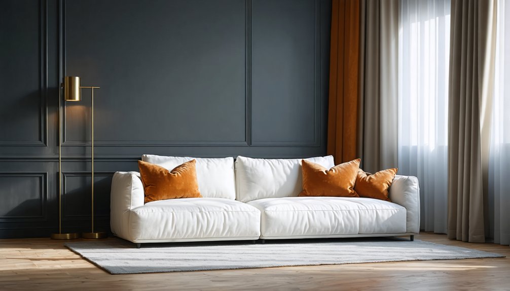
Balance Neutral and Bold Color Choices Throughout Your Home
We’ll examine how neutrals provide a timeless foundation that adapts across design eras while offering visual stability for walls and large surfaces.
Strategic placement of bold colors in controlled doses—through the 60-30-10 rule—creates focal points without overwhelming the space’s psychological comfort.
Timeless Appeal of Neutrals
While design trends cycle through waves of popularity, neutral paint colors maintain their position as the backbone of sophisticated interiors. We’re seeing a decisive shift toward softer tonal variations that bring depth and personality to spaces without sacrificing versatility.
Layering warm neutrals—from creamy whites to muted rusts and soft browns—creates environments that feel both current and enduring.
Why neutrals continue to dominate:
- They provide flexibility to refresh your space with colorful accents without committing to full repaints
- Warm undertones in beiges, tans, and creams establish intimacy in gathering spaces while maintaining broad appeal
- Strategic use increases resale value by appealing to diverse buyer preferences
These foundational colors allow your furniture, art, and personal style to take center stage while creating the calming backdrop that makes a house feel like home.
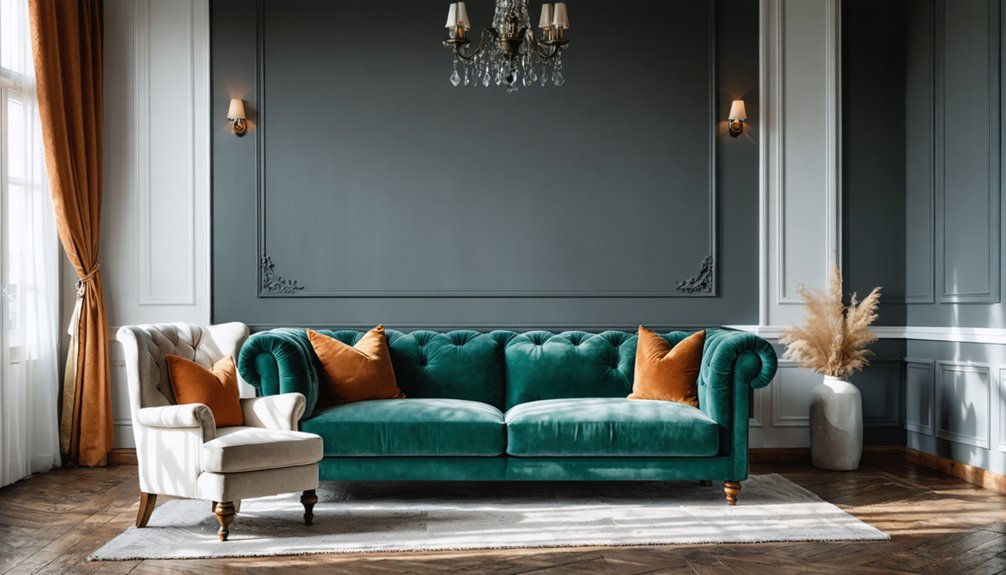
Strategic Bold Color Placement
Strategic color placement transforms neutral foundations into dynamic environments through intentional bursts of saturated hues. We recommend integrating jewel tones like emerald greens or sapphire blues on accent walls to establish focal points that direct attention without overwhelming your space.
The 60-30-10 rule guarantees harmony: allocate 60% to dominant wall colors, 30% to secondary elements like drapery, and 10% to targeted accents. Bringing vibrancy through focal points—such as vibrant upholstery or statement furniture—creates visual interest while maintaining balance.
Color blocking with complementary contrasts, like pairing deep burgundy with navy, adds sophistication. Room-specific placement matters: position saturated colors where you need energy, use deep tones for intimacy. This strategic approach allows us to create spaces that feel both intentional and inviting.
Combining Neutrals With Accents
Mastering the interplay between neutrals and bold accents demands adherence to proven proportion formulas that prevent visual chaos while maximizing chromatic impact. We recommend the 60-30-10 rule: dominant neutrals establish your foundation, secondary hues provide shift, and accent colors deliver strategic punch. Undertone blending connects your grays, beiges, and whites coordinate seamlessly with bolder choices, creating color spectrum harmony throughout your space.
Essential coordination strategies include:
- Grounding vibrant statement furniture with neutral walls for long-term versatility
- Pairing cool-toned neutrals with warm brass or wood elements for dimensional balance
- Selecting gray-infused greens as flexible neutrals that accommodate bold accessories
Navy chairs against soft gray walls or plants punctuating beige backgrounds demonstrate this principle beautifully. The textures you introduce—woven cottons, velvets—elevate these combinations beyond simple color application into sophisticated, cohesive environments where you’ll thrive.
Test Paint Samples in Different Lighting Before Committing
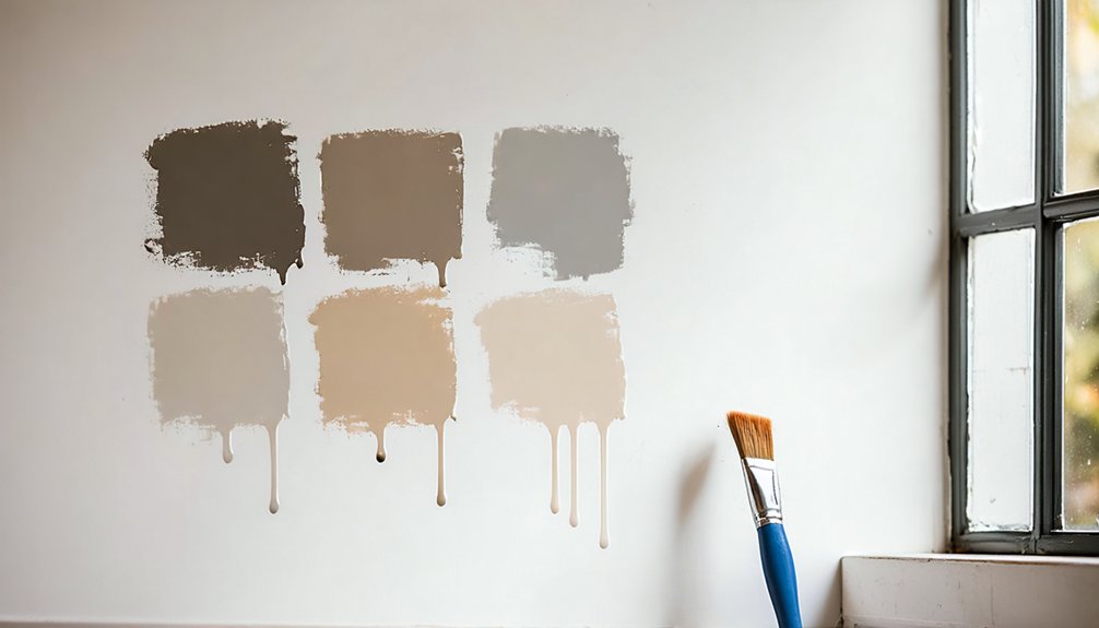
Few design decisions prove as deceptive as selecting paint colors from small chips under fluorescent store lighting. We recommend painting 2×2-foot sections on multiple walls to observe lighting conditions during sample testing.
Natural daylight reveals the truest hue—morning’s cool bluish quality mutes warm tones, while afternoon’s golden glow accentuates them. Artificial sources dramatically alter perception: fluorescent casts sharp blue undertones, incandescent enriches saturation, and LED varies from warm to cool depending on temperature rating.
Inspect samples in various scenarios by positioning swatches where they’ll receive both direct and indirect light. Live with your selections for at least 48 hours, checking morning, afternoon, and evening conditions. Test against existing furniture, flooring, and décor to guarantee harmonious integration throughout your space.
Unify Connected Spaces With Cohesive Color Flow
To unify your connected spaces effectively:
- Maintain consistent undertones across all rooms, staying within either warm or cool temperature families
- Repeat strategic accent colors through textiles, artwork, and decor elements to create visual threads
- Establish rhythm by varying placement and scale of similar patterns and textures throughout your home
Use Accent Walls to Incorporate Bold Colors Strategically
Accent walls transform ordinary rooms into distinctive spaces by channeling bold color choices onto a single strategic surface rather than overwhelming an entire area. We recommend selecting walls without doors or windows to maximize visual impact, prioritizing entrance focal points where eyes naturally land first.
Accent wall dimensions should complement room proportions—oversized walls in spacious areas create drama, while smaller surfaces suit intimate environments. For accent wall spatial planning, consider visibility from primary living areas and architectural features that enhance effectiveness.
Deep hues like forest green or burnt orange establish grounding effects, while complementary color pairs enable sophisticated color-blocking techniques. We encourage testing paint samples first, as this prevents costly mistakes.
Integrating artwork and decorative accessories amplifies the accent wall’s impact, creating cohesive aesthetics that welcome you home.
Create Visual Transitions Between Rooms for a Polished Look
Strategic color shifts between rooms establish architectural cohesion that elevates your home’s overall aesthetic impact. We’ll enhance visual connectivity by aligning color transformations with natural traffic flow patterns, beginning at your front entrance and progressing through each space. Doorway thresholds should match the room you’re entering, while door swing direction determines threshold color placement.
To seamlessly blend color transitions, apply these proven techniques:
- Implement color wheel relationships using complementary colors for vibrant contrast or analogous hues for serene continuity
- Repeat accent colors through furniture, artwork, and décor to reinforce room-to-room connections
- Balance bold statements with neutral foundations like taupe or soft gray to prevent overwhelming transformations
This methodical approach creates sophisticated flow that makes your entire home feel expansive, connected, and professionally designed.
Frequently Asked Questions
What Paint Finish Works Best for High-Traffic Areas Like Hallways?
We recommend easy to clean satin sheen for hallways since it resists scuffs beautifully. While durable eggshell finish works for lighter traffic, satin’s enhanced cleanability and balanced luminosity make it our preferred choice for high-movement zones.
How Do I Choose Colors That Hide Imperfections on Walls?
We’ll select darker tones with flat or matte finishes that absorb light and minimize surface irregularities. Satin sheen paints work for subtle coverage, while textured paint finishes create depth that camouflages imperfections, ensuring your walls look flawlessly refined together.
Should I Paint the Ceiling the Same Color as Walls?
We’d consider ceiling paint considerations like room size and height before matching. Visual effects of ceiling color transform spatial perception—same-color schemes expand small spaces while contrasting tones define boundaries. Let’s evaluate your room’s architecture and desired atmosphere together.
How Often Should Interior Paint Colors Be Updated or Refreshed?
Most rooms need invigorating every 5-7 years, though frequency of color updates varies by traffic. We recommend an ideal repainting timeline of 2-4 years for high-use spaces and 8-10 years for low-traffic areas to maintain your home’s aesthetic integrity.
Can I Mix Different Paint Brands in the Same Room?
We can confidently mix different paint brands in the same room when ensuring paint color compatibility. Brand paint blending works seamlessly with water-based formulas, though we’ll achieve ideal results by maintaining consistent paint types throughout our space.