We’ve found that light neutrals with LRV values above 60 are your most powerful tool for expanding small rooms—they maximize light reflection and create an open foundation. Pair these with cool-toned pastels in blues or greens, which trigger atmospheric recession through color temperature psychology. For seamless flow, we recommend monochromatic schemes that dissolve visual boundaries by layering tints vertically. Strategic accent walls in deeper hues can restructure proportions when you’re ready to explore advanced techniques that amplify spaciousness further.
Key Takeaways
- Light neutrals with LRV values of 60+ maximize light reflection and create visual spaciousness in compact rooms.
- Soft blues and muted greens visually expand space through atmospheric recession and color temperature psychology.
- Pastels with 20-40% chroma introduce airy ambiance while maintaining visual weightlessness that expands spatial perception.
- Monochromatic schemes dissolve visual boundaries by layering lighter tints on ceilings with mid-tones on walls.
- Strategic accent walls with deep hues restructure proportions, while vertical stripes elongate narrow spaces visually.
Light Neutrals: The Foundation of Spacious Design
Light neutrals establish the visual framework that makes compact spaces feel larger through strategic light manipulation. We’re selecting soft neutral palettes with high LRV values—typically 50-60 or above—to maximize light reflection and create expansive visual flow. Sherwin-Williams’ Grayish SW 6001 and Front Porch SW 7651 deliver this crisp, airy quality essential for small kitchens and bedrooms.
Our approach emphasizes flexible undertone coordination across varied exposures. Warm undertones in Alabaster SW 7008 and Greek Villa SW 7551 strengthen naturally in limited light conditions, while blue-gray options like Classic Gray provide neutral depth without coldness. We’re balancing these selections with room orientation—specifying 60+ LRV formulas like Rivers Edge SW 7517 for north-facing spaces to counter inherent blue light and maintain warmth throughout your home.
Pastel Hues for Airy Ambiance
Pastels introduce sophisticated chromatic softness that expands spatial perception through controlled saturation levels—we’re deploying hues at 20-40% chroma to maintain visual weightlessness while establishing distinct color character. These selections leverage light reflection qualities that maximize natural illumination while their space enhancing properties create dimensional illusions.
Our recommended palette includes:
- Benjamin Moore Windmill Wings 2067-60: Periwinkle delivering crisp, open atmosphere
- Benjamin Moore Blue Stream CC-730: Muted bedroom-appropriate blue promoting tranquility
- Benjamin Moore Potpourri Green 2029-50: Yellow-tinged green brightening compact areas
- Benjamin Moore Calla Lily 283: Sunny yellow energizing trim applications
- Benjamin Moore Hint of Pink 884: Light overhead treatment expanding vertical perception
We’re pairing these hues strategically—lighter ceiling variations against coordinating walls, or pastel trim like Calla Lily balancing gray-lavender surfaces for cohesive spatial expansion.
Cool Tones That Visually Expand Your Space
Cool tones operate through color temperature psychology—hues registering below 5000K on the Kelvin scale trigger atmospheric recession, where surfaces appear to recede from viewers’ perceptual plane rather than advance toward it.
We’re leveraging this optical phenomenon when we select soft blues that soothe—pale sky mimics or gray-blue hybrids like Sherwin-Williams Rock Candy SW 6231—to expand perceived square footage. These wavelengths calm visual processing while creating dimensional depth.
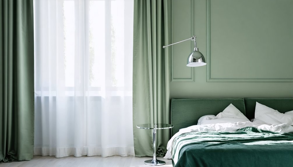
Equally effective are muted greens that center our spatial experience. Sherwin-Williams Sea Salt SW 6204 and Benjamin Moore Healing Aloe 1562 soften architectural boundaries through their receding nature. Soft aquas introduce tranquility in bathrooms, while subtle sage tones bring zen-like expansion.
The science holds: cooler temperatures visually withdraw, warmer temperatures advance. We’re choosing recession for spatial amplification.
Monochromatic Schemes for Seamless Flow
When we commit to a single color family across all surfaces and furnishings, we eliminate the visual stops that fragment spatial perception—those jarring shifts where one hue confronts another. Instead, thoughtful gradations guide the eye smoothly from ceiling to baseboard, creating continuity that expands perceived dimensions.
Monochromatic layering dissolves visual boundaries, allowing sight lines to travel uninterrupted—transforming cramped spaces into expansive, cohesive environments.
To execute this approach effectively, we layer strategically:
- Anchor with a hero hue (sage, navy, terracotta) and deploy lighter tints on ceilings, mid-tones on walls, deeper shades on built-ins
- Vary saturation vertically like an ombré gradient—pale overhead, richest at floor level
- Introduce intentional textures (velvet, rattan, knit) to prevent flatness
- Mix sheens (matte walls, satin cabinetry, gloss trim) so light catches differently
- Add metallics or mirrors to reflect the color family and amplify spaciousness
Strategic Accent Walls and Painting Techniques
While monochromatic schemes unify through repetition, accent walls operate through deliberate contrast—a single surface that commands attention and restructures how we perceive the room’s proportions. We’ll select walls with natural focal points: behind beds, sofas, or fireplaces where broad, uninterrupted surfaces maximize impact.
Deep hues like navy or forest green create depth when applied with satin finish application, which forgives imperfections while adding subtle sophistication.
Strategic furniture positioning amplifies this effect—centering beds or seating arrangements transforms the accent into a deliberate backdrop. We recommend testing undertones in varying light conditions before committing.
For narrow spaces, vertical stripes elongate visually, while diagonal splits with lighter upper triangles elevate ceiling perception. These techniques give us control over spatial experience, turning architectural limitations into intentional design opportunities that welcome rather than constrain.
Frequently Asked Questions
How Do Furniture Colors Interact With Wall Paint in Small Rooms?
Think of furniture and walls as dance partners—we coordinate lighter furniture with pale walls to amplify space through reflectivity. Strategic furniture placement near windows maximizes lighting considerations, while contrasting accents create depth that welcomes you into our thoughtfully designed sanctuary.
Should Trim and Molding Match Wall Color in Compact Spaces?
We recommend coordinated trim colors that match walls in compact spaces to create visual continuity. However, subtle contrast options using different sheens work beautifully too—they define architectural details while maintaining the expansive, cohesive feel we’re achieving together.
What Sheen Works Best for Small Rooms With Low Natural Light?
We’ll illuminate your space like morning sun breaking through clouds: eggshell sheen works best for small, dimly lit rooms. It reflects subtle light while hiding imperfections, whereas flat sheen absorbs precious luminosity, making compact areas feel darker and smaller.
Can Wallpaper Patterns Make Small Rooms Appear Larger Than Paint?
We’ve found that wallpaper actually makes rooms feel smaller than paint. However, strategic accent wall patterns with neutral wallpaper prints in larger scales and lighter values can minimize this effect while adding visual interest to your space.
How Does Ceiling Height Affect Paint Color Choices for Small Rooms?
Ceiling height variations dramatically influence our color selections—low ceilings need lighter, low-contrast palettes to enhance perceived spaciousness effects, while higher ceilings benefit from mid-tone hues that prevent coldness and create the cozy, proportional atmosphere we’re all seeking together.