We’ve found that soft blues consistently deliver the best sleep outcomes, as they signal your brain to lower internal temperature and extend sleep duration. Muted sage greens reduce cortisol levels while promoting clarity, and gentle grays minimize cognitive stimulation for overthinkers. Warm neutrals like taupe create psychological safety without disrupting melatonin production. The science confirms that cooler, desaturated tones outperform bright or warm colors—and understanding how each shade physiologically affects your body’s sleep mechanisms will help you choose the ideal bedroom environment.
Key Takeaways
- Blue bedrooms consistently yield the longest sleep duration, with soft azure and powder blue tones signaling the brain to decrease internal temperature.
- Sage green lowers cortisol levels and heart rate, creating non-stimulating environments ideal for reducing anxiety and promoting rest.
- Soft gray tones lower blood pressure and minimize visual stimulation, reducing cognitive load for overthinkers during bedtime routines.
- Taupe and beige trigger psychological responses of safety and comfort, with layered neutrals outperforming flat, monotone applications.
- Brightness intensity affects sleep more than color itself; muted tones outperform saturated colors for signaling restorative brain states.
The Science Behind Color and Sleep Quality
When we select bedroom colors, we’re making decisions that extend far beyond aesthetic preference—we’re directly influencing our neurological and psychological states during the critical hours before sleep. Color perception triggers measurable emotional responses that fundamentally alter our ability to achieve restorative rest.
Research demonstrates that cooler tones reduce stress levels while warm, energizing hues activate our nervous system, increasing alertness when we need the opposite effect. What’s particularly fascinating is that brightness intensity impacts emotional response more profoundly than the color itself—light blue evokes more positive emotions than dark yellow.
This explains why calming beige shades and muted blue gray tones consistently outperform saturated alternatives in sleep environments. By understanding these psychological mechanisms, we can create bedrooms that signal our brains to shift into restorative mode.
Calming Blues: Nature’s Sleep Aid for Your Bedroom
Blue stands as the most physiologically validated color choice for sleep optimization, with empirical evidence demonstrating its capacity to lower both heart rate and blood pressure—two critical markers for initiating the body’s movement into restorative sleep states. We’ve identified soft azure hues—particularly sky and powder blues—as superior to saturated alternatives for pre-sleep environments. These lighter iterations signal your brain to decrease internal temperature while evoking the tranquility of expansive skies and calm waters.
When implementing blue in your sleep sanctuary, we recommend avoiding moody indigos that can trigger associations with sadness. Instead, pair cool-toned walls with neutral accents in white, gray, or warm woods. Research confirms blue bedrooms consistently yield the longest average sleep duration, establishing this wavelength as nature’s empirically-supported sleep aid for our shared pursuit of restorative rest.
Restful Greens: Bringing the Outdoors In
Green’s psychological impact on sleep quality stems from its documented ability to lower cortisol levels and heart rate, creating physiological conditions conducive to rest. We’ve observed that sage green’s muted, nature-derived tones reduce anxiety while promoting mental clarity, making it particularly effective in sleep environments where overstimulation must be minimized.
Deep greens establish what the Travelodge study confirms as ideal sleep sanctuaries, with participants averaging 7 hours and 36 minutes of sleep while reporting improved morning mood states.
Sage Green’s Calming Effect
As biophilic design principles gain traction in sleep-focused interiors, sage green emerges as a scientifically supported choice that bridges aesthetic appeal with measurable wellness benefits. We’ve observed its gray undertones create non-stimulating environments that actively reduce anxiety levels, making it particularly effective for those struggling with stress-related sleep disruptions.
The shade’s mood boosting effects extend beyond visual impact—when paired with complementary indoor plants, we amplify air purifying properties while strengthening our connection to nature’s restorative influence. Whether applied as full-scale color blocking or strategic accent walls, sage green fosters the balanced ambiance our bodies require for quality rest.
This versatile palette pairs seamlessly with rust tones for warmth or teal accents for classic sophistication, allowing us to personalize tranquil retreats.
Deep Green Sleep Sanctuary
When we shift from lighter sage tones to deeper forest hues, the psychological impact intensifies through what color researchers term “enveloping chromatic saturation”—a phenomenon where saturated walls create protective cocoons that signal our nervous systems to downshift into parasympathetic dominance.
Travelodge’s sleep study documented participants achieving 7 hours 36 minutes in green rooms, with deep green walls correlating to upbeat morning affect.
We’re seeing exceptional results with shades like Benjamin Moore’s Silver Marlin 2139-50, which demonstrates remarkable adaptability:
- Functions as chromatic neutral while maintaining sleep-inducing properties
- Fluctuates beautifully under versatile lighting considerations
- Amplifies tranquil decor elements through tonal contrast
These muted depths lower heart rates measurably while creating sophisticated sanctuaries where seasonal accents emerge against moody backdrops—transforming bedrooms into biophilic retreats without nature’s unpredictability.
Soothing Grays: The Perfect Neutral for Overthinkers
While vibrant colors often dominate bedroom design conversations, soft gray tones deliver exceptional sleep-promoting benefits through their unique ability to quiet mental chatter. Ranking 9/10 on sleep effectiveness scales, gray’s physiological impact includes lowered blood pressure and steadied heart rate—essential markers for quality rest. We’ve found this neutral particularly valuable for anxiety-prone sleepers, as its minimal visual stimulation reduces cognitive load during bedtime shift.
Gray’s chameleon-like quality adapts seamlessly to multifunctional lighting considerations, maintaining calming properties from dawn through dusk. When paired with warm illumination, it creates cozy atmospheres without overstimulation. The color’s versatility accommodates personal preference variations across modern and traditional aesthetics while supporting melatonin production. For overthinkers seeking mental quietude, gray’s understated sophistication offers a distraction-free sanctuary that helps racing thoughts settle naturally.
Warm Neutrals: Creating a Cozy Sleep Sanctuary
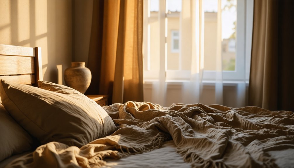
When we’re searching for colors that wrap our bedrooms in warmth without sacrificing sophistication, beige and taupe emerge as powerhouse neutrals backed by sleep science research. These earth-derived hues trigger psychological responses associated with safety and comfort—two prerequisites for the body’s natural sleep cascade—while maintaining enough visual interest to prevent sterile, clinical aesthetics.
Clay-inspired wall tones extend this philosophy further, grounding our sleep sanctuaries in organic pigments that our nervous systems inherently recognize as non-threatening.
Beige and Taupe Benefits
The science behind bedroom color selection reveals that neutral tones like beige and taupe prioritize sleep quality over aesthetic boldness. These earthy, sandy tones calm our bodies and still our minds, creating neurological responses that promote rest without alerting the brain.
We’ve found taupe particularly effective as a reliable shade for better sleep:
- Its balanced neutral with warm and cool notes feels steady and unobtrusive
- Acts like a warm hug delivering comfort similar to weighted blanket advantages
- Pairs beautifully with mood boosting bedroom plants and natural wood furnishings
Layered neutrals prove superior to flat, monotone applications. When we mix taupe walls with beige accents, wooden furniture, and earthy textiles, we establish timeless environments that support both immediate sleep needs and long-term livability through sophisticated tonal depth.
Earthy Clay Wall Tones
Moving deeper into warm neutral territory, washed clay-inspired terracotta tones deliver warmth without the intensity that disrupts sleep. These organic terracotta hues feel instinctively nurturing—they echo the earthy pigments our ancestors saw daily, triggering natural calming responses.
Through natural pigment mimicry, muted clays signal safety to our nervous systems, particularly effective in north-facing bedrooms where warmth counters cooler light.
Designer Isy champions these tones for their cocooning effect, especially when applied as limewash or paired with raw plaster walls. We’ve found they reduce visual noise while maintaining the grounding qualities essential for rest. Layer them with wooden headboards and natural textiles to amplify their earthy resonance.
For dynamic depth, introduce soft light blue accents—the combination creates a timeless, harmonious backdrop that genuinely supports better sleep.
Soft Pinks and Lavenders: Gentle Comfort for Relaxation
While bold colors dominate contemporary design trends, soft pinks and lavenders offer an understated elegance that directly supports restorative sleep. These gentle hues mirror nature’s sleep signals—the soft blush of dusk and twilight’s purple undertones—activating our innate relaxation response.
We’ve found these colors particularly effective when integrated thoughtfully:
- Soft pink with cream or ivory creates warmth without overstimulation, establishing a nurturing cocoon
- Lavender combined with soft grays balances the calm of blue with subtle warmth, reducing anxiety
- Rose gold or silver accents enhance harmonious color schemes while maintaining tranquility
The psychological connection between lavender’s color and the plant’s calming properties reinforces relaxation, while blush tones ease your mind into restfulness. These muted palettes exude sophistication, creating spaces where you belong—peaceful sanctuaries designed specifically for renewal.
Grounding Earth Tones: Embracing Natural Serenity
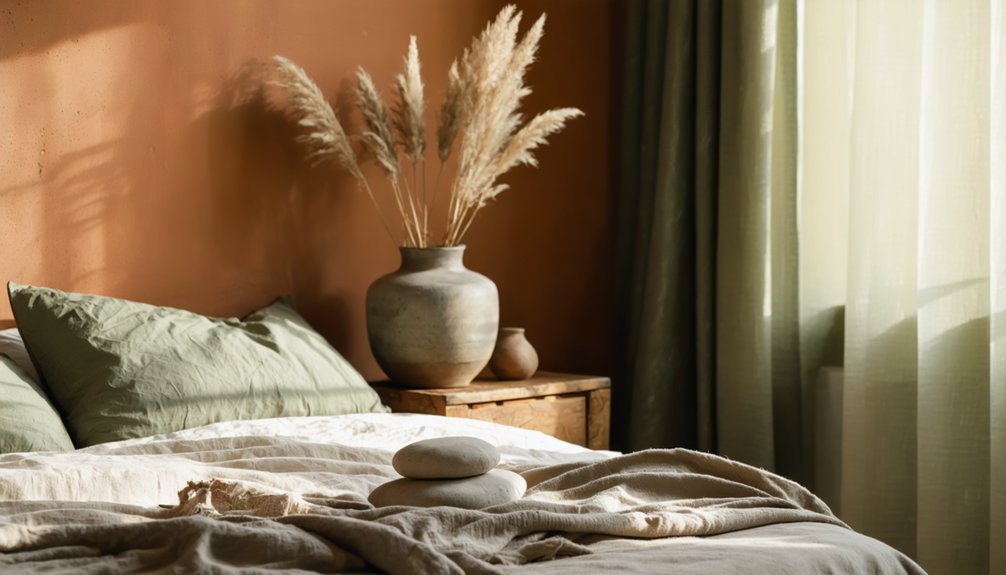
Beyond the delicate whispers of pink and lavender lies a color family rooted in nature’s most fundamental elements—earth tones that anchor our bedrooms in organic serenity. We’re drawn to these hues because they mirror the landscapes that naturally calm us: taupe’s muted warmth, beige’s sandy neutrality, and forest green’s woodland tranquility.
Research confirms blue lowers blood pressure and heart rate, while green reduces anxiety and facilitates sustained sleep. These pared down palettes create visual simplicity that quiets racing minds, particularly when we layer earth inspired accents in stone tones and terracotta.
Brightness matters—lighter greens evoke outdoor freshness, while soft greys establish restful neutrality. Grey’s grounding properties combine with brown’s stability to generate the reassurance we need for restorative sleep, transforming bedrooms into sanctuaries of belonging.
Frequently Asked Questions
What Paint Finish Works Best for Bedroom Walls to Promote Sleep?
We recommend flat paint finish or eggshell paint finish for bedroom walls. Both diffuse light effectively, minimizing glare that disrupts sleep. Research supports matte surfaces for rest, while eggshell adds subtle durability—creating the calming sanctuary we all deserve.
How Do I Choose Between Multiple Calming Colors for My Bedroom?
Like finding your personal sanctuary, we’ll guide you through choosing calming color palettes by evaluating lighting’s impact on colors, testing samples under various conditions, and honoring your instinctive responses to create your ideal sleep environment together.
Can I Combine Two Sleep-Promoting Colors in One Bedroom Effectively?
Absolutely—we can expertly layer two sleep-promoting colors by combining warm and cool tones while balancing light and dark shades. This evidence-based approach creates sophisticated depth, enhancing both visual interest and restorative sleep benefits we all desire.
Should I Paint the Ceiling a Different Color Than the Walls?
We recommend yes—38% report better sleep after bedroom color changes. A contrasting ceiling color in cooler tones enhances depth and calm, while a monochromatic color scheme using lighter ceiling tints creates spaciousness without overstimulation for our restful sanctuary.
How Long Does It Take to Adjust to a New Bedroom Color?
We’ll typically notice immediate emotional responses to new bedroom colors, though complete color acclimation timeline spans several weeks. The typical adjustment period involves habituation through repeated exposure, with sleep benefits emerging once consistent relaxation patterns develop in your refreshed space.